
Table of Contents
In the world of statistics and data analysis, few concepts are as frequently misinterpreted as the relationship between correlation and causality. This confusion isn’t trivial: it can lead to erroneous conclusions and inappropriate decisions in scientific research, marketing, or public policy.
What is Correlation?
Correlation measures the relationship or association between two variables. Specifically, it indicates whether these variables tend to move together in a predictable way. This relationship is typically quantified by a correlation coefficient, with the Pearson coefficient being the most common.
This coefficient ranges from -1 to 1:
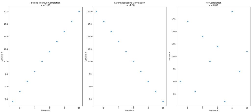
- A value close to 1 indicates a strong positive correlation: when one variable increases, the other tends to increase as well.
- A value close to -1 indicates a strong negative correlation: when one variable increases, the other tends to decrease.
- A value close to 0 suggests no linear relationship between the variables.
Python code for correlation
The following code demonstrates how to calculate the correlation between datasets and provides two options for visualizing the correlation: scatter plots and a correlation matrix heatmap
- Imports libraries:
numpyfor numerical operations.matplotlib.pyplotfor plotting graphs.pandasfor handling structured data (tables).seabornfor more advanced and stylish plots (like heatmaps).
- Creates three datasets:
data1_xanddata1_y:- Strong positive correlation (as
xincreases,yincreases steadily).
- Strong positive correlation (as
data2_xanddata2_y:- Strong negative correlation (as
xincreases,ydecreases steadily).
- Strong negative correlation (as
data3_xanddata3_y:- No clear correlation (random pattern between
xandy).
- No clear correlation (random pattern between
- Calculates correlation coefficients:
- Uses
np.corrcoef(x, y)to find the Pearson correlation coefficient for each dataset pair. corr1,corr2, andcorr3store these values.
- Uses
- Plots three scatter plots:
- Creates a figure with 3 side-by-side scatter plots.
- Each plot:
- Shows how the
xandydata points relate visually. - Displays the correlation value (
r) in the title. - Labels the axes.
- Shows how the
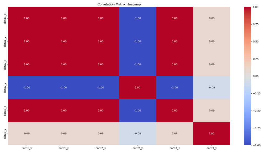
- Builds a correlation matrix:
- Combines all data into a
pandasDataFrame. - Calculates the correlation matrix across all datasets.
- Combines all data into a
- Plots a heatmap:
- Displays the correlation matrix as a colorful heatmap using
seaborn. - Colors indicate the strength and direction of relationships (blue = negative, red = positive).
- Each cell in the matrix shows the numerical correlation value.
- Displays the correlation matrix as a colorful heatmap using
import numpy as np
import matplotlib.pyplot as plt
import pandas as pd
import seaborn as sns

# Create data
# Strong positive correlation
data1_x = [1, 2, 3, 4, 5, 6, 7, 8, 9, 10]
data1_y = [2, 4, 6, 8, 10, 12, 14, 16, 18, 20]

# Strong negative correlation
data2_x = [1, 2, 3, 4, 5, 6, 7, 8, 9, 10]
data2_y = [20, 18, 16, 14, 12, 10, 8, 6, 4, 2]

# No correlation
data3_x = [1, 2, 3, 4, 5, 6, 7, 8, 9, 10]
data3_y = [5, 17, 3, 14, 9, 12, 1, 19, 7, 11]

# Calculate correlations using numpy
corr1 = np.corrcoef(data1_x, data1_y)[0, 1]
corr2 = np.corrcoef(data2_x, data2_y)[0, 1]
corr3 = np.corrcoef(data3_x, data3_y)[0, 1]

# Plots three scatter plots
fig, axes = plt.subplots(1, 3, figsize=(18, 5))

axes[0].scatter(data1_x, data1_y, alpha=0.7)
axes[0].set_title(f'Strong Positive Correlation\nr = {corr1:.2f}')
axes[0].set_xlabel('Variable X')
axes[0].set_ylabel('Variable Y')

axes[1].scatter(data2_x, data2_y, alpha=0.7)
axes[1].set_title(f'Strong Negative Correlation\nr = {corr2:.2f}')
axes[1].set_xlabel('Variable X')
axes[1].set_ylabel('Variable Y')

axes[2].scatter(data3_x, data3_y, alpha=0.7)
axes[2].set_title(f'No Correlation\nr = {corr3:.2f}')
axes[2].set_xlabel('Variable X')
axes[2].set_ylabel('Variable Y')

plt.tight_layout()
plt.show()

# Create a dataframe and plot the correlation matrix
df = pd.DataFrame({
    'data1_x': data1_x,
    'data1_y': data1_y,
    'data2_x': data2_x,
    'data2_y': data2_y,
    'data3_x': data3_x,
    'data3_y': data3_y
})

corr_matrix = df.corr()

plt.figure(figsize=(10, 8))
sns.heatmap(corr_matrix, annot=True, cmap='coolwarm', fmt='.2f')
plt.title('Correlation Matrix Heatmap')
plt.show()
The three scatter plots:
The correlation matrix by seaborn Heatmap:
What is Causality?
Causality implies that one variable is directly responsible for the change observed in another variable. In other words, A causes B if a change in A produces a change in B.
Unlike correlation, which can be calculated directly from data, causality cannot be established by simple statistics. It requires a deep understanding of the mechanism connecting the variables, often validated through controlled experiments.
The Classic Trap: Correlation Does Not Imply Causation
Here’s the core issue: two variables can be strongly correlated without any causal relationship between them. Several scenarios can explain correlation without causation:
Coincidence: Sometimes variables evolve together by pure chance, especially over short periods or with small samples.
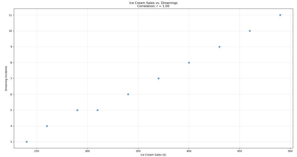
Confounding variable: A third variable can influence both observed variables, creating the illusion of a direct relationship. For example, ice cream sales and drownings both increase in summer, not because eating ice cream causes drownings, but because hot weather influences both behaviors.
Reverse causality: The direction of causality may be misinterpreted. If A and B are correlated, it’s possible that B causes A rather than the reverse.
Python code for Correlation x Causation
The code demonstrates an example of correlation versus causation
- It shows a strong positive correlation between ice cream sales and drowning incidents.
- However, it makes it clear that one does not cause the other.
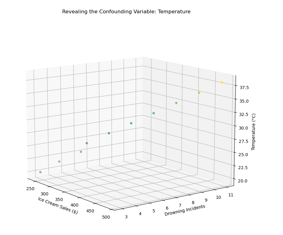
- Instead, a third hidden factor — temperature (the “confounding variable”) — causes both:
- When it’s hotter, people buy more ice cream.
- When it’s hotter, more people go swimming, which (unfortunately) increases the risk of drownings.
Step-by-step Explanation:
Imports libraries:
numpyfor numerical calculations (especially correlation).matplotlib.pyplotfor creating 2D plots.pandasfor working with tabular data (imported but not used directly here).seabornfor stylish plots (also imported but not used here).mpl_toolkits.mplot3dto create 3D plots.
Creates three datasets:
confounding(confounding variable): represents temperature, increasing from 20°C to 38°C.ice_cream_sales: ice cream sales that increase as temperature rises (with some manual noise added).drownings: drowning incidents that also increase with temperature (again, with slight variations).
Calculates correlation between ice cream sales and drownings:
- Uses
np.corrcoef(ice_cream_sales, drownings)[0, 1]to calculate the Pearson correlation coefficient between ice cream sales and drownings. - Stores the result in
corr_ice_drowning.
Plots a scatter plot:
- Creates a scatter plot showing ice cream sales (x-axis) versus drowning incidents (y-axis).
- Displays the correlation value (
r = calculated_value) in the title. - Adds labels to the axes and a light grid in the background.
Visualizes with the confounding variable in 3D:
- Creates a 3D scatter plot where:
- x-axis = ice cream sales,
- y-axis = drowning incidents,
- z-axis = temperature (the confounding variable).
- Colors the points based on temperature, using the “viridis” colormap.
- Shows that the relationship between ice cream sales and drownings is not directly causal, but both increase due to rising temperature.
import numpy as np
import matplotlib.pyplot as plt
import pandas as pd
import seaborn as sns
from mpl_toolkits.mplot3d import Axes3D  # Necessário para o gráfico 3D

# 1. Create data
# Fixed confounding variable (e.g., temperature)
confounding = [20, 22, 24, 26, 28, 30, 32, 34, 36, 38]

# Ice cream sales increase with temperature (some noise manually added)
ice_cream_sales = [240, 260, 290, 310, 340, 370, 400, 430, 460, 490]

# Drowning incidents also increase with temperature (some noise manually added)
drownings = [3, 4, 5, 5, 6, 7, 8, 9, 10, 11]

# 2. Calculate correlation between ice cream sales and drownings
corr_ice_drowning = np.corrcoef(ice_cream_sales, drownings)[0, 1]

# 3. Create a scatter plot
plt.figure(figsize=(10, 6))
plt.scatter(ice_cream_sales, drownings, alpha=0.7)
plt.title(f'Ice Cream Sales vs. Drownings\nCorrelation: r = {corr_ice_drowning:.2f}')
plt.xlabel('Ice Cream Sales ($)')
plt.ylabel('Drowning Incidents')
plt.grid(True, alpha=0.3)
plt.show()

# 4. Visualize with the confounding variable in 3D
fig = plt.figure(figsize=(12, 8))
ax = fig.add_subplot(111, projection='3d')
ax.scatter(ice_cream_sales, drownings, confounding, c=confounding, cmap='viridis')
ax.set_xlabel('Ice Cream Sales ($)')
ax.set_ylabel('Drowning Incidents')
ax.set_zlabel('Temperature (°C)')
ax.set_title('Revealing the Confounding Variable: Temperature')
plt.show()
The correlation between Ice Cream and Drowing Incidents:
Visualization of the confounding variable (temperature):
Striking Examples of Misleading Correlations
The history of statistics is full of amusing or concerning examples of correlations without causal links:
- A strong correlation exists between the number of films Nicolas Cage appears in each year and the number of swimming pool drownings in the United States.
- The divorce rate in Maine strongly correlates with per capita margarine consumption.
- There’s a correlation between the decline of pirates on the high seas and the increase in global temperatures (used by some to parody arguments about climate change).
You can check more this kind of correlations in: https://www.tylervigen.com/spurious-correlations
How to Establish Causality
To determine if a relationship is causal, researchers use several approaches:
Randomized controlled trials: By randomly assigning subjects to different groups and manipulating only one variable, we can isolate its effect.
Longitudinal studies: Observing the same subjects over a long period can help establish the temporal sequence of events, a prerequisite for causality.
Advanced statistical methods: Techniques like instrumental variables, propensity score matching, or structural equation models can help control for confounding variables.
Python code for Difference-in-Differences method
The following program simulates a randomized controlled experiment, applies a treatment effect to one group, and uses the Difference-in-Differences method to estimate the true causal effect. Then it visualizes how the groups change before and after.
Step-by-step Explanation:
Imports and Settings:
np.random.seed(42)makes sure that the random numbers are reproducible — always the same when running the code.n = 200sets the sample size: 200 observations for each group.
Creates two groups:
treatment_groupandcontrol_groupare two separate groups, each with 200 random values from a normal distribution (mean 0, standard deviation 1).- These represent baseline measurements before any treatment or intervention.
Applies a treatment effect:
treatment_effect = 0.5means the treatment should increase the outcome by 0.5 units on average.treatment_group_after:- Adds the
treatment_effect(+0.5) to the baseline, - Plus some small random noise (
np.random.normal(0, 0.2, n)) to simulate natural variability.
- Adds the
control_group_after:- Only adds random noise — no treatment effect applied.
Calculates means:
treatment_mean_beforeandtreatment_mean_after: average values of the treatment group before and after the intervention.control_mean_beforeandcontrol_mean_after: same thing for the control group.
Calculates the Difference-in-Differences (DiD) estimate:
did_estimate = (treatment_after - treatment_before) - (control_after - control_before)- Difference-in-Differences (DiD) is a method to estimate the causal effect by:
- Measuring the “before vs. after” difference for both groups,
- Then subtracting the control group’s difference (baseline change) to isolate the treatment effect.
Visualizes the results:
- Creates a bar plot showing:
- The mean before and after for both groups side-by-side.
- The title shows the estimated causal effect (
did_estimate) based on the DiD calculation. - Adds labels, legend, and a grid for clarity.
# Simple simulation of a randomized controlled experiment
np.random.seed(42)
n = 200

# Create two groups: treatment and control
treatment_group = np.random.normal(0, 1, n)  # Baseline values
control_group = np.random.normal(0, 1, n)    # Baseline values

# Apply treatment effect (this is the causal effect we want to measure)
treatment_effect = 0.5
treatment_group_after = treatment_group + treatment_effect + np.random.normal(0, 0.2, n)
control_group_after = control_group + np.random.normal(0, 0.2, n)  # Only random variation, no treatment

# Calculate means
treatment_mean_before = np.mean(treatment_group)
treatment_mean_after = np.mean(treatment_group_after)
control_mean_before = np.mean(control_group)
control_mean_after = np.mean(control_group_after)

# Calculate the difference-in-differences (a causal inference method)
did_estimate = (treatment_mean_after - treatment_mean_before) - (control_mean_after - control_mean_before)

# Visualize the results
labels = ['Before', 'After']
treatment_means = [treatment_mean_before, treatment_mean_after]
control_means = [control_mean_before, control_mean_after]

plt.figure(figsize=(10, 6))
x = np.arange(len(labels))
width = 0.35

plt.bar(x - width/2, treatment_means, width, label='Treatment Group')
plt.bar(x + width/2, control_means, width, label='Control Group')

plt.ylabel('Mean Value')
plt.title(f'Randomized Controlled ExperimentnEstimated Causal Effect: {did_estimate:.2f}')
plt.xticks(x, labels)
plt.legend()
plt.grid(True, alpha=0.3)
plt.show()
Applications in Signal Processing
In signal processing, the distinction between correlation and causality is particularly important. Cross-correlation between two signals can indicate their similarity but doesn’t necessarily reveal a causal relationship.
Causal filters, for example, are designed so that the output at a given time depends only on current and past inputs, never on future inputs. This causality constraint is fundamental in real-time signal processing.
Conclusion
The next time you hear “studies show a correlation between X and Y,” remember that this statistical relationship doesn’t prove that X causes Y. Always ask yourself: Are there confounding variables? Has the relationship been tested experimentally? Is there a plausible mechanism explaining how X could cause Y?
By developing this critical thinking when facing statistics, you’ll avoid falling into the trap of confusing correlation and causality, an essential skill in the era of big data and omnipresent information.