
In a world flooded with data, the ability to understand and interpret it has become an essential skill. Descriptive statistics provides the tools needed to transform raw data into actionable information. Whether you’re a student, professional, or simply curious, mastering these fundamental concepts will help you effectively analyze the data around you.
What is Descriptive Statistics?
Descriptive statistics encompasses methods that summarize and present data in a clear, concise manner. Unlike inferential statistics, which aims to draw conclusions about a population from a sample, descriptive statistics focuses solely on describing the available data.
Imagine you have exam scores for 100 students. Without statistical tools, these 100 values represent just a mass of numbers difficult to interpret. Descriptive statistics allows you to synthesize them to extract the essentials.
Measures of Central Tendency: The Heart of Your Data
Measures of central tendency are the first fundamental tool of descriptive statistics. They indicate around which value your data is concentrated.
The arithmetic mean is the most well-known. It corresponds to the sum of all values divided by their number. For our exam scores, a mean of 14/20 indicates the general level of the class. However, the mean can be influenced by extreme values.
The median represents the value that separates your data set into two equal parts. If the median of the scores is 15/20, it means half of the students scored less than 15, and the other half scored more than 15. The median is less sensitive to extreme values than the mean.
The mode corresponds to the most frequently occurring value. If 20 students scored 16/20, and that’s the most frequent score, then 16 is the mode.
Check out this Python example, where we analyze students’ grades and transform them into visual insights:
import numpy as np
import matplotlib.pyplot as plt

# Sample data: exam scores
scores = [65, 72, 78, 82, 83, 85, 85, 86, 89, 90, 91, 92, 94, 95, 96]

# Calculate measures of central tendency
mean_score = np.mean(scores)
median_score = np.median(scores)
# Finding mode manually (numpy doesn't have a mode function)
from scipy import stats
mode_score = stats.mode(scores)[0][0]

print(f"Mean: {mean_score}")
print(f"Median: {median_score}")
print(f"Mode: {mode_score}")

# Visualize the data with central tendency measures
plt.figure(figsize=(10, 6))
plt.hist(scores, bins=10, alpha=0.7, color='skyblue')
plt.axvline(mean_score, color='red', linestyle='dashed', linewidth=2, label=f'Mean: {mean_score:.1f}')
plt.axvline(median_score, color='green', linestyle='dashed', linewidth=2, label=f'Median: {median_score}')
plt.axvline(mode_score, color='purple', linestyle='dashed', linewidth=2, label=f'Mode: {mode_score}')
plt.xlabel('Exam Scores')
plt.ylabel('Frequency')
plt.title('Distribution of Exam Scores with Measures of Central Tendency')
plt.legend()
plt.grid(True, alpha=0.3)
plt.show()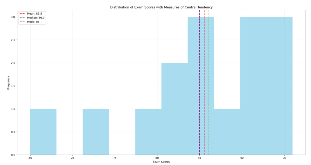
Measures of Dispersion: Understanding Variability
Knowing only the central tendency is not enough. Two data sets can have the same mean but be very different. That’s why measures of dispersion are essential.
The range is the difference between the maximum and minimum values. Simple to calculate, it gives a first idea of dispersion but is very sensitive to extreme values.
Variance measures the average of squared deviations from the mean. The higher the variance, the more dispersed the data. Its unit being the square of the data unit, its interpretation is not always intuitive.
Standard deviation, the square root of variance, is easier to interpret because it’s expressed in the same unit as the data. For a normal distribution, approximately 68% of values lie within one standard deviation of the mean.
Continuing from the previous code, let’s now use Python to calculate the measures of dispersion and visualize them in a chart:
# Calculate measures of dispersion
range_score = max(scores) - min(scores)
variance_score = np.var(scores, ddof=1)  # ddof=1 for sample variance
std_dev_score = np.std(scores, ddof=1)   # ddof=1 for sample standard deviation

print(f"Range: {range_score}")
print(f"Variance: {variance_score:.2f}")
print(f"Standard Deviation: {std_dev_score:.2f}")

# Visualize standard deviation
plt.figure(figsize=(10, 6))
plt.hist(scores, bins=10, alpha=0.7, color='skyblue')
plt.axvline(mean_score, color='red', linestyle='solid', linewidth=2, label=f'Mean: {mean_score:.1f}')
plt.axvline(mean_score + std_dev_score, color='orange', linestyle='dashed', linewidth=2,
            label=f'Mean + 1 SD: {mean_score + std_dev_score:.1f}')
plt.axvline(mean_score - std_dev_score, color='orange', linestyle='dashed', linewidth=2,
            label=f'Mean - 1 SD: {mean_score - std_dev_score:.1f}')
plt.xlabel('Exam Scores')
plt.ylabel('Frequency')
plt.title('Distribution of Exam Scores with Standard Deviation')
plt.legend()
plt.grid(True, alpha=0.3)
plt.show()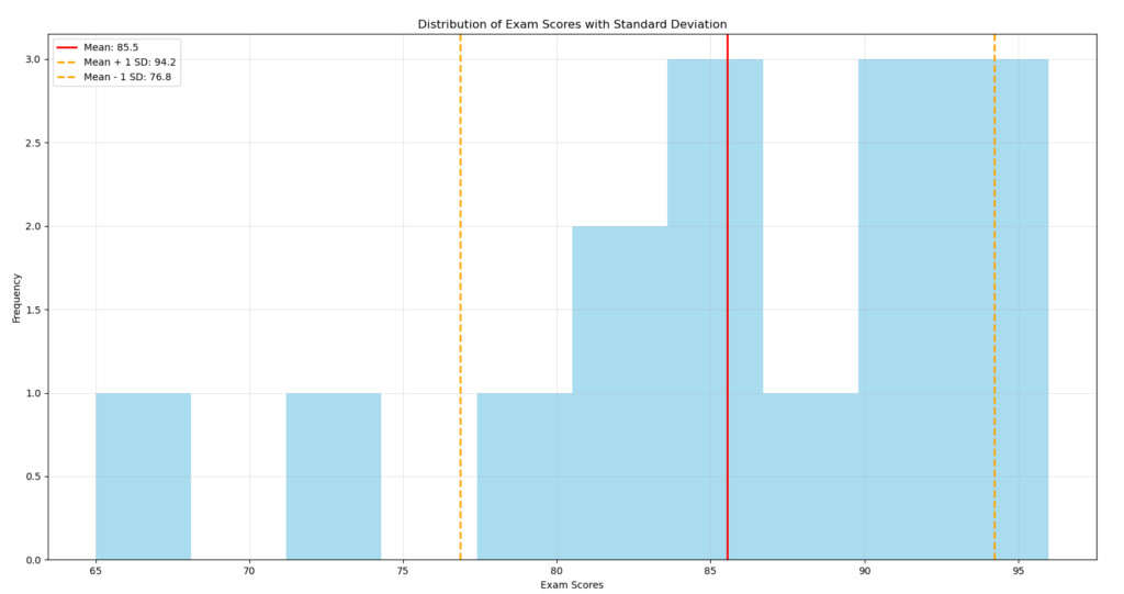
Visualizing for Better Understanding
Numbers alone are not always sufficient to grasp the nature of your data. Graphical representations effectively complement the analysis.
Histograms divide your data into intervals and display the frequency of each interval. They allow you to visualize the distribution and quickly identify its shape (symmetric, asymmetric, multimodal).
Box plots summarize five key pieces of information: minimum, first quartile, median, third quartile, and maximum. They are particularly useful for detecting outliers and comparing multiple data sets.
Scatter plots allow you to explore the relationship between two variables, the first step toward correlation analysis.
# Create different visualizations
fig, axes = plt.subplots(1, 3, figsize=(18, 6))

# Histogram
axes[0].hist(scores, bins=10, color='skyblue', edgecolor='black')
axes[0].set_title('Histogram of Exam Scores')
axes[0].set_xlabel('Scores')
axes[0].set_ylabel('Frequency')
axes[0].grid(True, alpha=0.3)

# Box plot
axes[1].boxplot(scores, vert=False, patch_artist=True,
                boxprops=dict(facecolor='skyblue'))
axes[1].set_title('Box Plot of Exam Scores')
axes[1].set_xlabel('Scores')
axes[1].grid(True, alpha=0.3)

# Scatter plot (scores vs. student index)
axes[2].scatter(range(1, len(scores)+1), scores, color='skyblue', edgecolor='black')
axes[2].set_title('Scatter Plot of Exam Scores')
axes[2].set_xlabel('Student Index')
axes[2].set_ylabel('Scores')
axes[2].grid(True, alpha=0.3)

plt.tight_layout()
plt.show()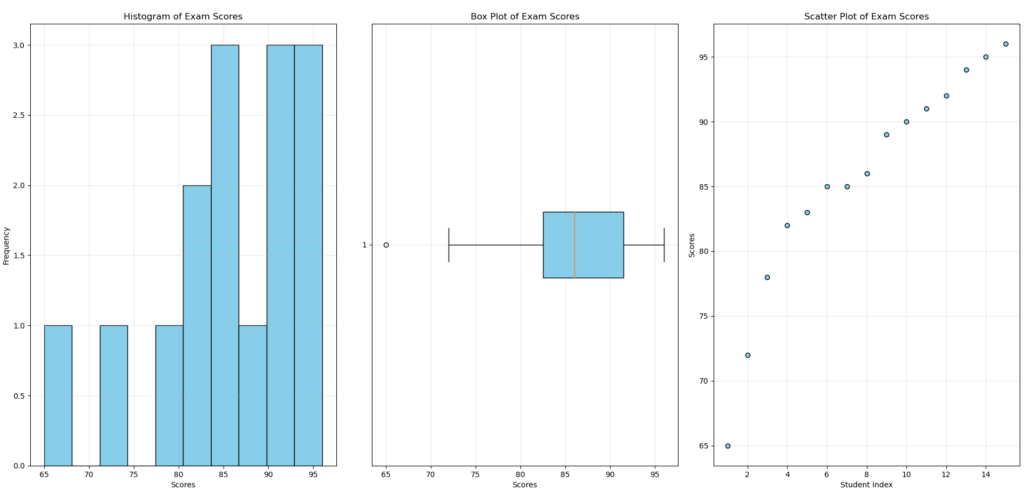
Descriptive statistics forms the gateway to more complex analyses like signal processing or machine learning. By mastering these fundamentals, you lay the necessary foundation for exploring the vast world of data science and artificial intelligence.
The next time you encounter a data set, don’t hesitate to use these tools to extract the essentials and make informed decisions based on facts rather than intuition.